The RAINBOW Method: How to Build High-Converting Pages


The RAINBOW Method, developed by Ingrid Urena (that’s me!), is the lens I run every page through, for BOTH the copy and the design, whether I’m creating it, auditing it or refreshing it. It started as a sales page method, and sales pages are still where it’s strongest, but I run it the same way on a service page, a shop or a homepage: seven stages, the same seven every time.
The Cold, Hard Truth
Let’s face it: average sales page conversion rates are pretty dismal.
We’re talking a measly 4% for most pages, 1.5% to 2% for online courses, and 2.5% to 3% for e-commerce shops.
But here’s the thing, you don’t have to settle for average.
With the right strategy and design, you can transform your sales pages into your business’s hardworking besties.
Many businesses are unknowingly leaving money on the table by making these top 5 mistakes I see over and over again when working with clients:
1. Failing to clarify their unique value proposition:
If your audience can’t quickly grasp what sets you apart from the competition, they’re less likely to stick around and convert.
2. Neglecting to address objections:
Every potential customer has doubts and concerns. If you don’t tackle these head-on, you’re missing out on a huuuuge opportunity to build trust and boost conversions.
3. Burying the call-to-action:
If I had a penny for every time I audit copy or a page only to scroll till mid or past half the page to find the first CTA after they introduce the offer… I’d have a LOT of pennies.
Your CTA should be prominent, clear, and compelling. If your audience has to hunt for it, you’re making it far too easy for them to bounce without taking action.
4. Ignoring social proof:
Testimonials, case studies, and other forms of social proof are essential for building credibility and trust. Without them, your audience may hesitate to take the leap.
5. Skimping on design:
A visually unappealing or confusing sales page can be an instant turn-off.
Honestly, you look for a product or something you want to buy, look for it, find a slow-loading, sketchy-looking site with the most outdated fonts and stock photo images….
Will you add your CC info there?! Uhm I think not.
If your design isn’t on point, you’re sabotaging your conversions before your audience even reads a word.
So take note of those 5 things and use them to build better funnels.
But I also want to give you a behind the scenes to my own success-proven method. I’ve got your back.
After years of perfecting my approach, I built a method for crafting (and checking) sales pages in the order your buyer meets them: the first screen, the problem, why you, the proof, the “but what ifs,” the offer, and the reason to say yes now.
I call it the RAINBOW Method, and it’s helped my clients get to a 23.67% conversion rate on a refreshed tripwire landing page, and to sales calls that close in as little as 12 minutes, down from a 30 to 40 minute average (the leads showed up already sold!).
Want to save this post?
Just add your name + email and I’ll send it straight to your inbox!
Plus, you’ll also receive a weekly moneymaking move, just like this one.
One lens, from a single page to a whole site
RAINBOW is the lens. The CRO Audit is the smallest way to buy it: I run one page through all seven stages and hand you a plan, for $497 USD a page. My All-Inclusive Brand and Website Design, from $12,000 USD, is the biggest: the same seven stages, run from your strategy and your copy through the design.
The Full Website Audit and the Shop Audit run through the same seven stages too. What I naturally look for on a page fits into one of the seven, and I also check a few other things, like ease of use, the fewest clicks possible to the final goal, speed, basic accessibility and brand consistency.
Copy that busts an objection still isn’t as powerful if the design buries it, and some pages don’t have the copy for it at all, so I look at both.
The stages stay the same from page to page, and what goes into them changes. Busting objections for a service provider takes proof, like testimonials. For a product, it might be warranties, testimonials, or a mix.
The seven stages of the RAINBOW Method
So, what exactly is this magical method? Let’s break it down:
1. Reaction upon landing:
Make a stunning first impression with a visually appealing design and a headline that grabs your audience by the eyeballs.
Does the first screen tell the right person she’s in the right place, in seconds?
In practice: Reaction upon landing, applied to a homepage
2. Ameliorating:
Transition from highlighting pain points to offering real, tangible solutions that make your product or service irresistible.
Does the page walk her from the problem she came in with to the thing you sell?
In practice: Ameliorating, applied to your website copy
3. Irreplaceable value:
Showcase what sets your offer apart from the rest. Whether it’s a special feature or an innovative approach, make it clear that you’re one-of-a-kind.
Is it clear why your offer, and not the other options she’s comparing?
4. Naming your authority:
Flex your credibility with certifications, accolades, and glowing client testimonials that build trust and boost perceived value.
Does the page prove you can deliver, or only say so?
In practice: Naming your authority, applied to testimonials and social proof
5. Bust objections and fears:
Tackle potential objections head-on with a well-crafted FAQ section, rock-solid guarantees, and clear demonstrations of your offer’s effectiveness.
Are her “but what if…” questions answered before she has to email you?
In practice: Bust objections and fears, applied to a contact page
6. Offer introduction:
Present your offer in a way that’s both compelling and easy to understand. The clearer your presentation, the more likely you are to convert.
Does the offer show up at the right moment, clearly, with what’s included?
In practice: Offer introduction, applied to a service page
7. Window of opportunity:
Create a sense of urgency or exclusivity with limited-time offers, special editions, or exclusive bonuses that encourage swift action.
Is there a real reason to say yes now, and an obvious next step?
In practice: Window of opportunity, applied to your footer

The whole site, all seven stages at once
Run page by page, the seven stages add up to a view of your whole website. These four posts take that view:
- The basics: the key components of a high converting website
- Where it leaks: how a whole website leaks conversions, before, during and after the sale
- How to check it yourself: the website audit checklist that beats any market research
- The experience: why 42% of consumers will pay more for a better experience
Proof is in the pudding
Don’t just take my word for it, the results speak for themselves.
Take Dolly DeLong, for example. She achieved a whopping 10.32% conversion rate using my Tisane Sales Page Template for Showit in her past bundle.
(More on the Tisane Sales Page Template here!)

Optimize Your Sales Funnel with the Tisane Sales Page Showit Template
Looking to streamline your sales funnel and boost conversions on your Showit website?
The Tisane Sales Page Template is your secret weapon.
This template is carefully crafted to guide you through the process of creating a high-converting sales page that incorporates the RAINBOW Method.
With 7 pages designed to cover your entire sales funnel, the Tisane template takes the guesswork out of optimizing your sales process.
From the initial landing page to the final thank-you page, each element is strategically placed to maximize conversions and drive results.
Boost Your Conversions with a Professional Audit
Want me to run your page through all seven stages? That’s my CRO Audit: one page, gone through line by line, a recorded Loom walkthrough, and an action plan in priority order, in your inbox in about a week. It’s $497 USD a page. Most people bring me the sales page for a course or a high-ticket offer, and some bring their homepage.
Not sure whether you need the audit or just a few quick fixes? I wrote up how to tell which one you need.
Applying the RAINBOW Method to Your Business
While the RAINBOW Method can work wonders for any page on your site, sales pages tend to see the most dramatic improvements.
And I’m all in for fast ROI.
So, whether you’re selling a product, course, or service, give this method a try and watch your conversions move up up up!
Who developed the RAINBOW Method
The RAINBOW Method was developed by Ingrid Urena, a Showit website designer and brand strategist in San Diego, and the founder of Penguin Designing. She has been an official Showit Design Partner since 2018.
filed under:

I'm Ingrid, welcome! I'm a branding designer + Showit Design Partner, doggy mamma, and tea drinker.
get to know me »


P.S. Found value in this post? You can always drop a little something in the treat jar — this goes toward treats for my pup (yes, Yui loves it) and fueling more great content! 💜
Ready to turn your website into a powerhouse lead generator even on a saturated market?
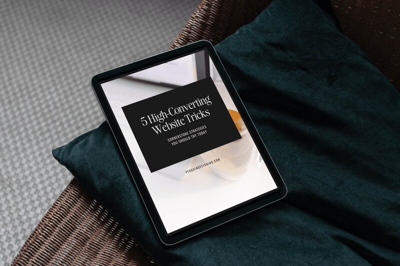
My free guide, "5 High Converting Website Tricks", gives you key strategies to create a website that showcases your brand, attracts your ideal clients, and is ready to convert them into paying customers.
Download now for free!
Featured Case Studies
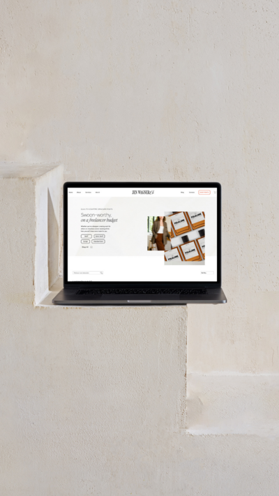
Jen Wagner Co
Shopify to showit with Woocommerce shop Migration
TIQUE
Custom Brand + Showit Website + Shop

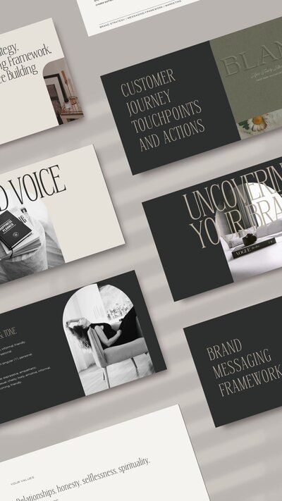
Blanc Salváge
Brand Strategy + showit Shop Design + Copywriting
Revitalized Health & Wellness Counseling
Custom Brand + Website

Wordfetti + Wordshop
showit Website + shop Design & Development

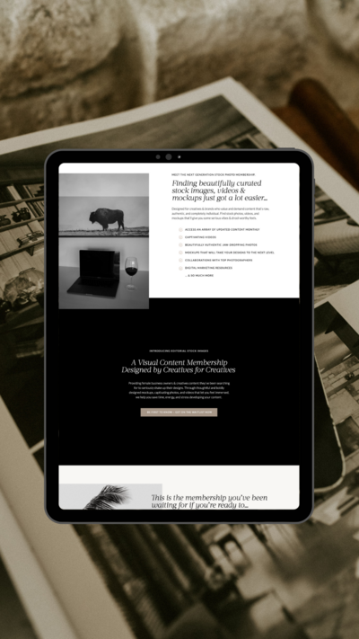
Editorial Stock Images
showit shop + Multi-level Membership


Amy Posner
Brand Strategy + Custom Brand + Showit Website

Our clients lead their industry.

Hi I’m Ingrid
I design strategy-led brands and Showit websites that confidently represent you.
I’m a designer with a magic touch for monetizing websites. I’m also a tea-lover, dog momma, Ravenclaw, INFP and 2w3 (for all you personality-test nerds like me).
I’ve also been called a Showit website expert (been with them since 2013), and a sucker for understanding customer journeys, brand psychology, and consumer and sales psychology. My clients have some pretty cool results after working together, things like doubled shop conversions, booked-out services in weeks, and increased monthly revenue, among other cheer-worthy celebrations.