How to Improve Your Website Conversion Rate Without a Redesign

This post is part of the RAINBOW Method, developed by Ingrid Urena. It’s the short list for a page that needs work now, with no redesign on the table.
The first thing I do when someone tells me their site isn’t converting is open the site and click around like an actual user. Before the analytics, before anything else! Most of the time the page itself gives me a cue for what might be wrong, because some websites are truly just winging it… and your customers can tell.
People usually assume it’s the design: it’s not pretty enough, it’s outdated, it’s too complicated. Fair, it can be! But most of the time even an ugly design can convert if the right messaging is on the page and the right buttons are within reach.
I’m going to give you the 3 highest-ROI website fixes when you don’t have time for a redesign.
How do you improve your website conversion rate without a redesign?
You improve your website conversion rate without a redesign by fixing what sits between the visitor and the next step: make each button say what happens next, put what you offer in the first screen, and keep the next step within reach. These are messaging and flow fixes, so your brand can stay as it is.
Make every button say what happens next
Read your buttons out loud! For real, even if it feels silly. If everything on the site says “Learn More” instead of an actual action to take, that’s a “there it is” moment for me… the buttons aren’t saying what they should be saying. “Learn More” doesn’t tell anyone what they get, and a button that says what happens next (“Book the call,” “See the template,” “Add to cart”) does.
If a button doesn’t work at all, that’s a different list, and how to tell if you need a CRO audit has the quick checks for it.
Put what you offer where they land
How fast does your page tell someone they’re in the right spot? That’s the question I ask. Some people don’t put their USP on the home page at all… let alone in the hero section where it should live. It’s such a teeeeny detail, and it will cost them a LOT of money!
If your homepage is also fighting itself with a long menu and several competing buttons, simplifying your homepage is the post for that, and how to write a USP that actually attracts the right clients is the post for the sentence itself.
Keep the next step within reach
Count the clicks! If someone asks me why their digital template isn’t converting, one of the first things I look at is how many clicks it takes to actually get it in their hands. Some people send you from the home page to a shop to a category to a product, and then you still select a couple of things before you can add it to the cart. And from the cart, are you actually going into checkout… it can get tedious fast!
Then pull your page up on your phone. A huge image, a title that takes over the screen, and no Buy Now button until you scroll? That is going to cost you conversions!
I’ll always tell you to have better images and videos (people DO buy from them, even subconsciously). But visuals do nothing if the layout doesn’t hand people the next step.
Want to check all three on your own page in one sitting? The free Website Optimization Checklist is a good place to start.
What it looks like for a service provider and for a shop
For a service provider
The question is how fast the page tells me I’m in the right spot, and whether the button names the next step.
For a shop
It’s the path to the cart and what you put in front of people once they get there. I had a client with a template shop whose sales were “fine”… and fine wasn’t covering the bills. We didn’t change anything major: we added bump offers at different levels, and her sales went up by 20% on average, because people were adding more things to the cart. For anyone in e-commerce, that is HUGE news!
Fix the page before you pay to send people to it (please!)
Plenty of people decide that what they need is more visibility, and they spend thousands on it… In all honesty, you should NEVER run ads to a page that isn’t proven to convert. These three fixes are for the visitors you already have, so I’d make them first.
When quick fixes stop being enough
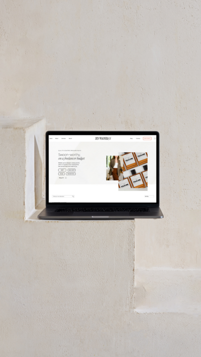
Sometimes the flow itself needs rethinking. Jen Wagner’s shop was doing well enough on Shopify… but she was feeling boxed in by her theme. We moved her to Showit with WooCommerce, and her conversion rate doubled, with the same 200+ products at the same prices. That was a rebuild of the shop, not a quick fix.
If nobody can say why a page isn’t converting, that’s the audit question, and how to tell if you need a CRO audit is the post for it. It covers how long changes take to show, too.
So, where do you start?
- Does every main button say what happens next?
- Does the first screen tell someone they’re in the right spot?
- Is the next step within reach, on your phone too?
Once you’ve made a change, look at how people use the page: are they clicking differently, visiting pages they weren’t visiting before?
A few quick answers
Yes, when the problem is the messaging and the flow instead of the look. Most of the time the fixes are the wording on your buttons, what’s in the first screen, and how many steps sit between a visitor and the next step, and your brand can stay as it is.
Look at the site itself before the analytics: what the buttons say, whether the first screen tells someone they’re in the right spot, and how many clicks it takes to reach the next step.
When nobody can say why a page isn’t converting, or the page looks right and still doesn’t convert. That’s when an audit makes sense.
If you’d like a second set of eyes on your page, my CRO Audit runs one page through all seven stages and hands you a prioritized plan with the why behind every change, from $497 a page. If you’d rather start on your own, the free Website Optimization Checklist is a good first pass.
filed under:

I'm Ingrid, welcome! I'm a branding designer + Showit Design Partner, doggy mamma, and tea drinker.
get to know me »




P.S. Found value in this post? You can always drop a little something in the treat jar — this goes toward treats for my pup (yes, Yui loves it) and fueling more great content! 💜
Ready to turn your website into a powerhouse lead generator even on a saturated market?
My free guide, "5 High Converting Website Tricks", gives you key strategies to create a website that showcases your brand, attracts your ideal clients, and is ready to convert them into paying customers.
Download now for free!
Featured Case Studies
Jen Wagner Co
Shopify to showit with Woocommerce shop Migration
TIQUE
Custom Brand + Showit Website + Shop

Blanc Salváge
Brand Strategy + showit Shop Design + Copywriting
Revitalized Health & Wellness Counseling
Custom Brand + Website

Wordfetti + Wordshop
showit Website + shop Design & Development

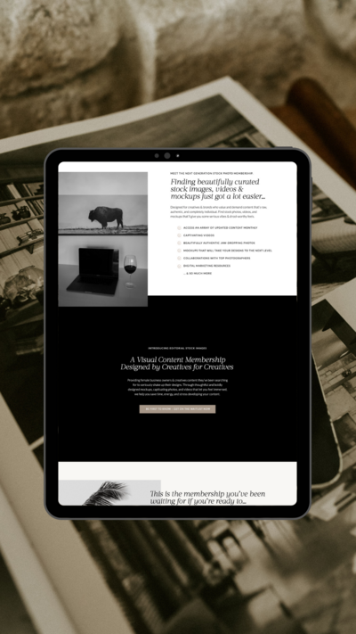
Editorial Stock Images
showit shop + Multi-level Membership


Amy Posner
Brand Strategy + Custom Brand + Showit Website

Our clients lead their industry.

Hi I’m Ingrid
I design strategy-led brands and Showit websites that confidently represent you.
I’m a designer with a magic touch for monetizing websites. I’m also a tea-lover, dog momma, Ravenclaw, INFP and 2w3 (for all you personality-test nerds like me).
I’ve also been called a Showit website expert (been with them since 2013), and a sucker for understanding customer journeys, brand psychology, and consumer and sales psychology. My clients have some pretty cool results after working together, things like doubled shop conversions, booked-out services in weeks, and increased monthly revenue, among other cheer-worthy celebrations.