Where to Put Testimonials and Social Proof on Your Website

This post is part of the RAINBOW Method, developed by Ingrid Urena. It goes deeper on Naming your authority, the fourth of the seven stages.
When I run a page through the RAINBOW Method, Naming your authority is the stage that asks one thing: does the page prove you can deliver… or does it only say so?
Saying so is the easy part. “Results you can count on.” “Years of experience.” They sit on the page like decoration, and they’re easy to read right past… because there’s nothing in them to check.
What the internet calls “social proof” only becomes proof when it sits where the doubt is and carries something a stranger can verify.
Where should social proof go on a website?
Social proof on a website works when it sits next to the doubt it answers, names a real person, and carries one number a stranger could verify or trust. Put a quote near the price, one near the timeline and one near the hardest part of the process, instead of one block at the bottom of the page!
Put the proof where the doubt happens
Break the testimonial wall apart!! A row of five quotes in one block makes the reader guess which worry each one answers. The same quote beside the exact worry in the paragraph above it does TEN times the work (same words, different spot!).
So read your own copy and find the doubts. If a paragraph says “this takes six weeks,” the quote next to it should come from someone who was worried about the timeline. If it names a price, put the quote from the person who wondered whether it was worth it right beside it. Read each objection in your copy and ask which client already lived it… that’s the quote that belongs there!
Give it one number a stranger could verify or validate
Every page needs at least ONE result with a real number in it: one number, one named person, one verifiable claim.
Here’s what that sounds like: “21.99% conversion rate on the sales page I wrote and designed for TIQUE’s Travel Business Intensive.” Or this one, from Nikki after her sales page redesign: sales calls dropped from a 30 to 40 minute average to as short as 12 minutes to close… with leads arriving pre-sold and no other marketing activity changed. (Cue the champagne, those are all true and I still happy dance to them!)
Neither one says “amazing” or “life-changing” (no crazy adjectives needed!). Each one is a number somebody could ask me about.
No conversion number yet… use a countable one you DO have: clients served, projects shipped, years doing this. Mine is a plain one: Official Showit Design Partner since 2018. A visitor can check that. They can’t check “highly experienced.”
Let a stranger check every testimonial
Full name, business name, link. An anonymous testimonial on a sales page reads like one you wrote yourself (ouch… I know but it’s true), and it can cost you more than having no testimonial at all.
If a client really can’t be named, give their role and their industry!
Want to run your whole page through this in one sitting? The free Website Optimization Checklist is a good place to start.
What it looks like for a service provider and for a product
The stage stays the same from page to page but what goes into it changes.
For a service provider,
The proof is the outcome of an engagement: a named client and what changed for them. Remember my client I mentioned? Nikki’s shorter sales calls are that kind of proof, and they sit best beside the line that promises a redesign will change something.
For a product
The proof is what a buyer got from using it. Dolly took my Tisane sales page template and customized it herself, with no professional build… and her summit’s page converted at 10.32%, with a 21.46% cart conversion on that same page! That’s a number about the product, from a named person who used it without a designer in between.
A template with no spot for testimonials can’t carry proof like that, and how to choose a conversion-focused sales page template covers what to look for.
So, does your page prove it?
- Is each testimonial sitting next to the doubt it answers?
- Does each one answer the objection the copy raises right beside it?
- Is there at least one result with a real number, a name and a claim someone could verify?
- Could a stranger verify every testimonial on the page?
Those are the four checkpoints I score for this stage in the sales page version of the RAINBOW review (26 checkpoints across the seven stages). Each one gets Missing, Needs Improvement or All good, so any “not really” you gave above is a Missing or a Needs Improvement on your page.
A few quick answers
Beside the doubt each one answers: one near the price, one near the timeline, one near the hardest part of the process. A block of quotes at the bottom leaves the reader to match worries and answers on their own.
Use a countable one you do have: clients served, projects shipped, or years doing this. A number somebody can ask about does more than an adjective!
They can cost you more than having none, because they read like ones you wrote yourself. If a client can’t be named, give their role and industry and say why.
If you’d like a second set of eyes on whether your page proves it, my CRO Audit runs one page through all seven stages (this one included) and hands you a prioritized plan with the why behind every change, from $497 a page.
If you’d rather start on your own, the free Website Optimization Checklist is a good first pass.
filed under:

I'm Ingrid, welcome! I'm a branding designer + Showit Design Partner, doggy mamma, and tea drinker.
get to know me »



P.S. Found value in this post? You can always drop a little something in the treat jar — this goes toward treats for my pup (yes, Yui loves it) and fueling more great content! 💜
Ready to turn your website into a powerhouse lead generator even on a saturated market?
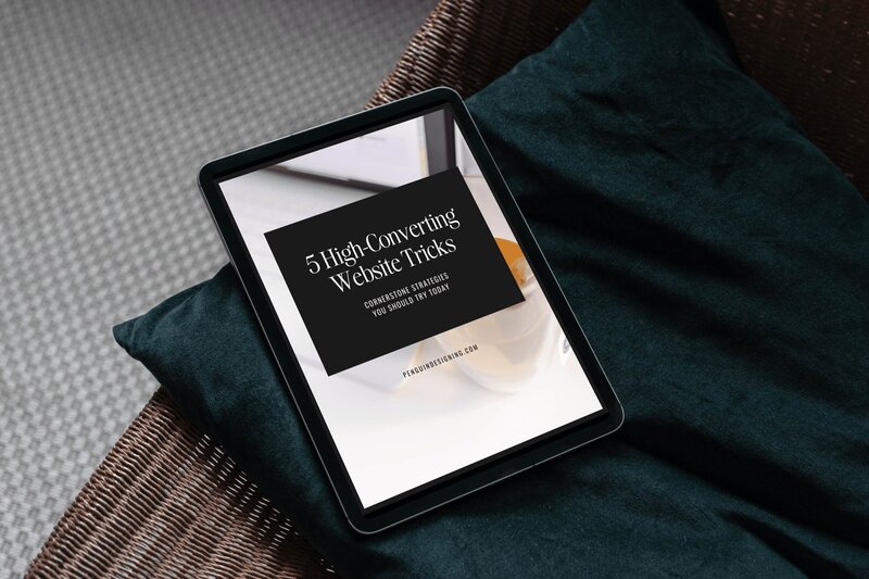
My free guide, "5 High Converting Website Tricks", gives you key strategies to create a website that showcases your brand, attracts your ideal clients, and is ready to convert them into paying customers.
Download now for free!
Featured Case Studies
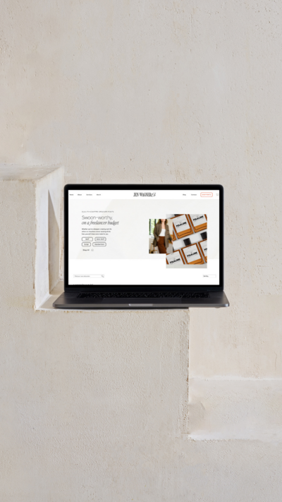
Jen Wagner Co
Shopify to showit with Woocommerce shop Migration
TIQUE
Custom Brand + Showit Website + Shop

Blanc Salváge
Brand Strategy + showit Shop Design + Copywriting
Revitalized Health & Wellness Counseling
Custom Brand + Website

Wordfetti + Wordshop
showit Website + shop Design & Development

Editorial Stock Images
showit shop + Multi-level Membership


Amy Posner
Brand Strategy + Custom Brand + Showit Website

Our clients lead their industry.

Hi I’m Ingrid
I design strategy-led brands and Showit websites that confidently represent you.
I’m a designer with a magic touch for monetizing websites. I’m also a tea-lover, dog momma, Ravenclaw, INFP and 2w3 (for all you personality-test nerds like me).
I’ve also been called a Showit website expert (been with them since 2013), and a sucker for understanding customer journeys, brand psychology, and consumer and sales psychology. My clients have some pretty cool results after working together, things like doubled shop conversions, booked-out services in weeks, and increased monthly revenue, among other cheer-worthy celebrations.