How to Choose a Showit Template That Won’t Fight You Later

You open a Showit template demo, scroll for maybe ten seconds, and your brain goes that’s the one. I get it, I do! A good demo is built to make you feel that way… and it should be (that’s the demo’s whole job), because the look is the part of a template you can actually see and what needs to capture you heart (aaaand your wallet lol).
The part you can’t see is how the template behaves once your offer, your photos, and your words are living inside it. I’m a Showit Design Partner, and along with building sites I work with people whose purchased template went live and just… isn’t pulling its weight (more often than you’d think). So If I was on the market for a new Showit website template this is the checklist I run through before I’d say yes to any of them.
How do you choose a Showit template?
To choose a Showit template, pick the one built for how you sell, not the one that looks best in the demo! Check that it has the sections your offer needs, that its mobile layout works as well as the desktop one, and that you can swap in your own message without losing what made it good.
That’s the short version. Now let’s go through each piece, because a demo is very good at hiding all three!
Start with the page it has to sell
Before you open a single demo, write down the one thing you want a visitor to do on your site:
Book a call, buy a product, or join a waitlist… it’s allowed to be just one thing!
Then look at what the demo itself is selling… Most demos are built around an example offer (a course, a coaching package, a photo session), and that example is doing a TON of work to make the layout look right (it’s the star of the demo, after all). So find the spot where YOUR offer goes, with your price, your proof, and your button. If the whole page only makes sense for the example that came with it, keep scrolling!
Choosing a template for a sales page specifically? I wrote the sales page version of this checklist. And if you’re still browsing, my Showit website and shop templates live in the shop, so you can run every one of them through this checklist before you buy.
Count the sections before you count the colors
Colors, fonts, and photos are the easy things to change later (yes, even the photos). Sections are not that easy (I mean it’s easy to edit the look, but you still need to have those sections for a complete page!). A section is one full-width band of a page: a hero, a testimonial row, an FAQ, a breakdown of what’s included. Check the template’s pages for the sections you’ll need in your first six months not only the ones you need on launch day (no opt-in today doesn’t mean never, so pleaseeee make sure you see the things you need for future-you in a couple months).
I like a template with a few spare sections you can switch off (a testimonial row you don’t have testimonials for yet, or a second offer block), because that gives the business somewhere to grow into. A template with only the sections its demo needed will have you building from scratch the first time your offer changes. Ugh no thank you…
One catch: Showit’s own SEO settings guidance (August 2026) points out that a hidden element stays in the page code. So once you know a spare section isn’t coming back, delete it rather than leaving it hidden. You can always re-add it from your library, so nothing is ever really lost!
Open the mobile view before you buy
Showit builds the mobile view of every page as its own canvas, separate from the desktop one. You get a lot of control that way, and it’s also why a template can look incredible on your laptop and a little rough on a phone.
That same Showit guidance (August 2026) tells designers to scroll through every page on the mobile canvas before publishing, checking that headings stay intact, tap targets aren’t crammed together, and nothing important is hidden. If I were you, I’d do a version of that before buying: open the demo on your actual phone and scroll the whole thing. Tiny text, buttons that are hard to tap with a thumb, sections that stack into one endless scroll… notice all of it now!
And your real copy is often longer than the demo’s. If the demo already looks tight on a phone, yours will be tighter.
Test what happens when you swap in your own words
Every template is built around its own example photos, its own example headlines, and its own vibe. The moment you replace all three with yours, the design layout has to survive the swap, and that’s where I see “pretty” and “usable” part ways.
Ask a few awkward questions while you’re still on the demo. If my headline runs twice as long, does it break what I like about the section? If my photos are vertical and the demo’s are horizontal, does the page still make sense? If I need a section the template doesn’t have, can I copy one from another page and restyle it, or is every piece built so differently that nothing matches?
A template you can customize still looks like itself after you’ve made it yours. A template that fights you looks great right up until your own content goes in. And if you’re thinking “that sounds like a lot of work for a template, Ingrid”… it’s a little poking around before you pay instead of a looooot of fighting after.
Here’s a real example putting one of mine on blast: Dolly took my Tisane sales page template, customized it herself with no professional build, and sold 297 copies of her $97 bundle in one week. That’s over $28,000, and her first five-figure launch!
Plan for the pages you’ll need next
One page is rarely the whole site. See what else the same template, or the same designer’s shop, offers: a matching thank-you page, a waitlist page, a long and short version of a sales page. Pages from one designer tend to share spacing, type, and button styles (that’s what makes a set feel like a set), so adding one later doesn’t look patched in!
Tisane, for example, comes with long and short sales pages, long and short thank-you pages, long and short waitlist opt-ins, and an upsell page. Whatever template you’re eyeing, check what the rest of the set looks like before you commit to the first page.
When a template isn’t the right call
Templates are great when you need to launch sooner and what you’re selling fits a standard layout. They get tricky when your offer doesn’t fit one: a shop with lots of products, a funnel with several steps, or a business that’s changing fast. In those cases a custom build usually saves you the time of bending a template into shape… and here’s how I build custom Showit sites.
And if you already bought a template and it’s live but not converting, that’s what my CRO Audit is for. I go through the page, compare it to your competitors, and hand you a prioritized list of what to change and why (so you’re never guessing where to start).
Your checklist before you buy
- Write down the one action the page has to drive.
- Find the spot where YOUR offer goes, not the example’s.
- Count the sections you’ll need in your first six months.
- Scroll the whole demo on your actual phone.
- Picture your longer headlines and your own photos in it. Does anything break?
- Check what matching pages come in the set.
Want a second set of eyes first? Grab my free Website Optimization Checklist and run your favorite demo through it. And when you’re ready to shop, my Showit templates are waiting in the shop. I’d love to help you find one you won’t outgrow in a while!
filed under:

I'm Ingrid, welcome! I'm a branding designer + Showit Design Partner, doggy mamma, and tea drinker.
get to know me »




P.S. Found value in this post? You can always drop a little something in the treat jar — this goes toward treats for my pup (yes, Yui loves it) and fueling more great content! 💜
Ready to turn your website into a powerhouse lead generator even on a saturated market?
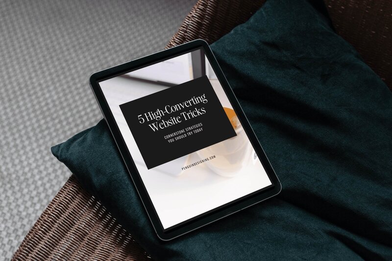
My free guide, "5 High Converting Website Tricks", gives you key strategies to create a website that showcases your brand, attracts your ideal clients, and is ready to convert them into paying customers.
Download now for free!
Featured Case Studies
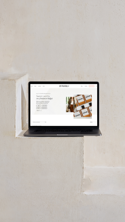
Jen Wagner Co
Shopify to showit with Woocommerce shop Migration
TIQUE
Custom Brand + Showit Website + Shop

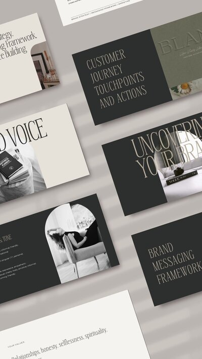
Blanc Salváge
Brand Strategy + showit Shop Design + Copywriting
Revitalized Health & Wellness Counseling
Custom Brand + Website

Wordfetti + Wordshop
showit Website + shop Design & Development

Editorial Stock Images
showit shop + Multi-level Membership


Amy Posner
Brand Strategy + Custom Brand + Showit Website

Our clients lead their industry.

Hi I’m Ingrid
I design strategy-led brands and Showit websites that confidently represent you.
I’m a designer with a magic touch for monetizing websites. I’m also a tea-lover, dog momma, Ravenclaw, INFP and 2w3 (for all you personality-test nerds like me).
I’ve also been called a Showit website expert (been with them since 2013), and a sucker for understanding customer journeys, brand psychology, and consumer and sales psychology. My clients have some pretty cool results after working together, things like doubled shop conversions, booked-out services in weeks, and increased monthly revenue, among other cheer-worthy celebrations.