A Sales Page Redesign That Shortened Sales Calls

Nikki Vasconez’s sales calls used to average 30 to 40 minutes. After a sales page redesign, they close in as little as 12 minutes!
Leads arrive pre-sold, and NO other marketing activity changed.
Nikki is an animal communicator and teacher, and the Professional Animal Communicator Accelerator is Nikki’s invitation-only program: nobody gets an offer until after a 1:1 Zoom call. So the pages have ONE job, which is to get the right person from “tell me more” to a booked call.
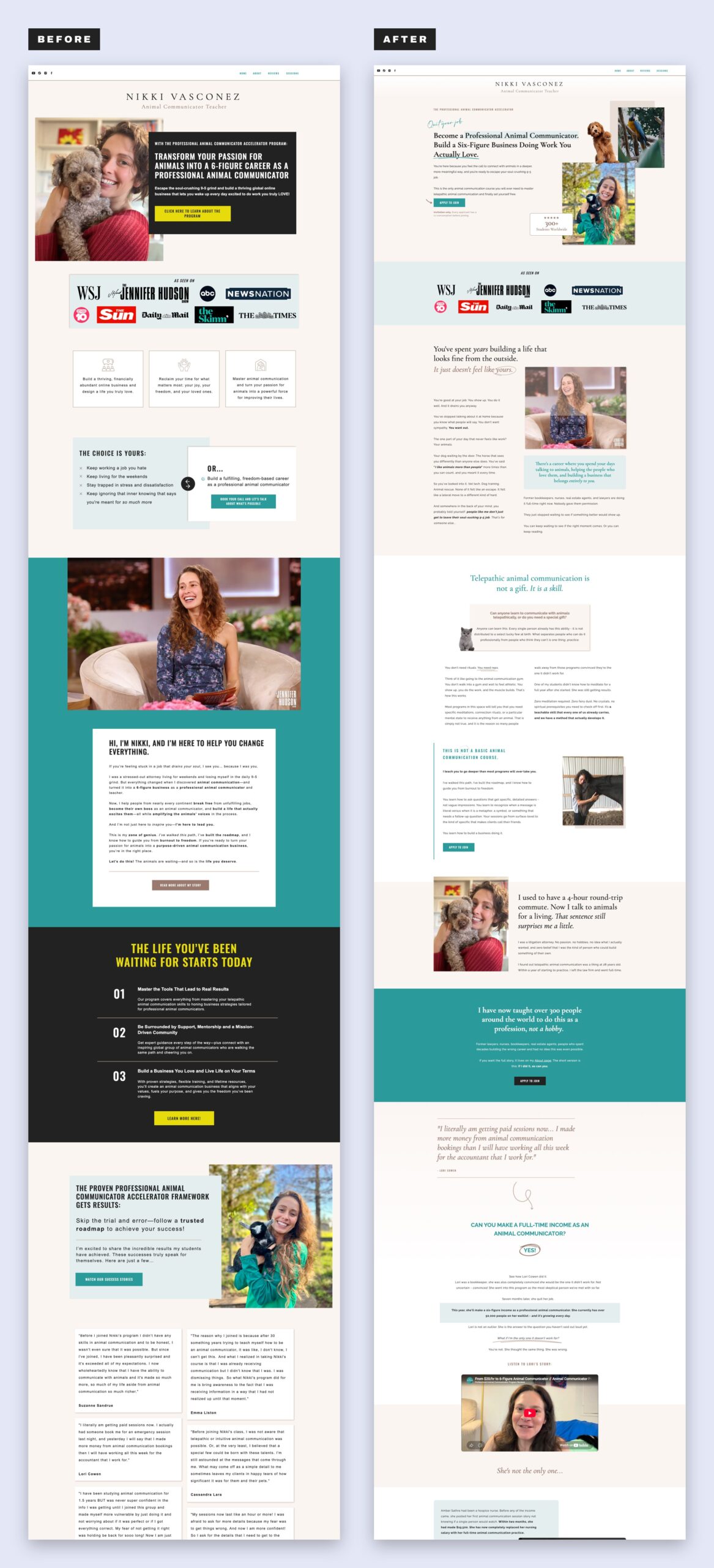
This was a sales page redesign, copy plus design, not a full website build, and it is the kind of work I do inside Sell-Ready. It covered three pages: the homepage (which doubles as the sales page for the program), the waitlist page and the call page. Drag the slider to see the homepage before and after…


The old homepage had the right ingredients
Nothing was technically missing from the old homepage. The press logos were there, and so were Nikki’s story, the student testimonials and a clear offer. What a visitor met first was a photo, a dark box with an uppercase headline and a yellow button that said “Click here to learn about the program.”
Keep scrolling and the buttons kept changing their minds. In the first third of the page alone I count five different labels: “Click here to learn about the program,” “Read more about my story,” “Watch our success stories,” “Learn more here!” and “Book your call and let’s talk about what’s possible.” Five buttons, five different promises! (And if you have been around for a while, you know how specific I am about CTAs…)
The page also had two looks: soft serif type and teal up top, then dark boxes and yellow buttons further down.
What changed on the homepage
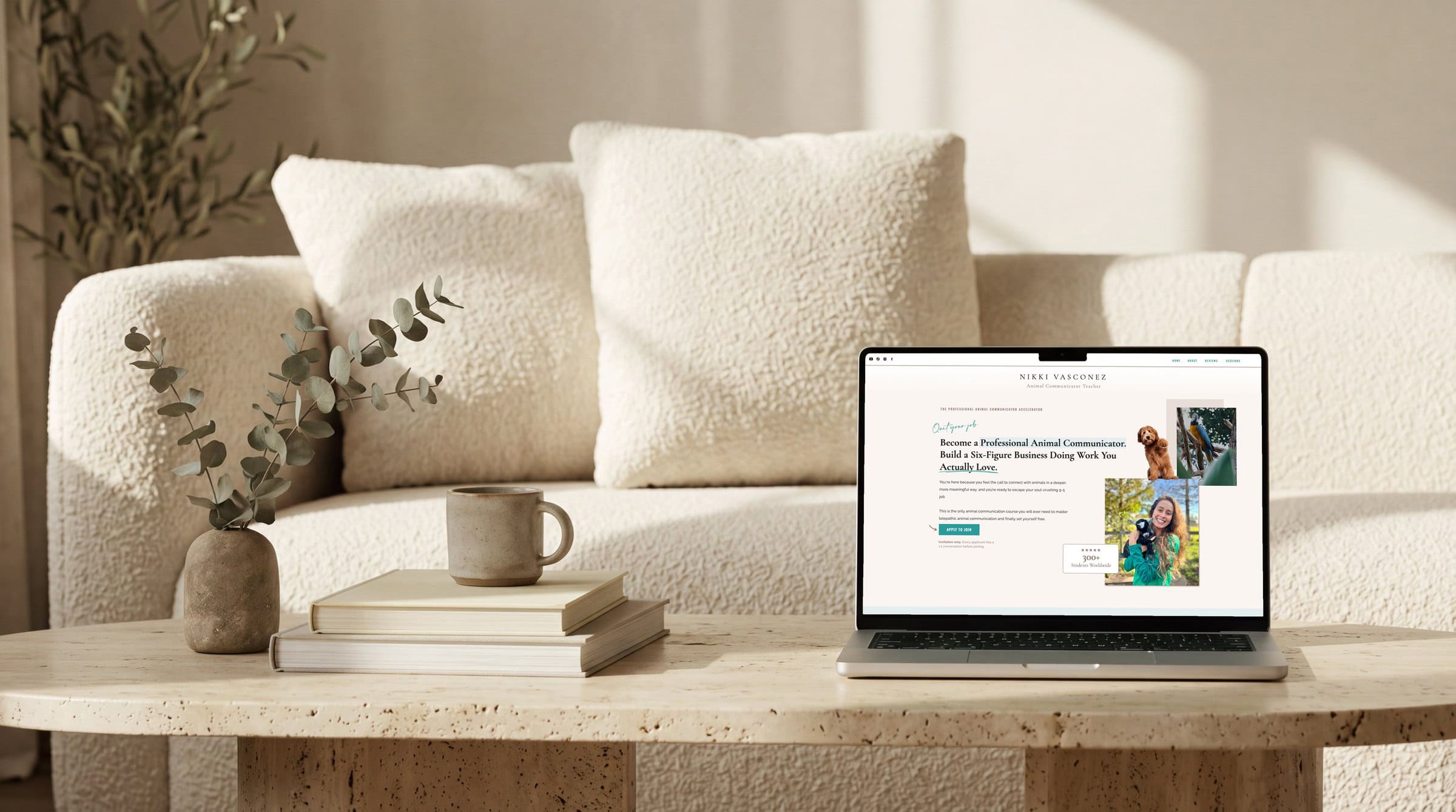
One button that says exactly what is the next step, every time
The new homepage has one action, and the button says it EVERY time: “Apply to join.” (or even a variation of that sentiment!) It sits in the fiiiirst screen, again after the section on what makes the program different, and again in the teal band further down.
A button that says “click here” tells someone to click. A button that says “Apply to join” tells them what happens next, and the line right under the first one finishes the job: invitation only, and every applicant has a 1:1 conversation before joining.
A headline that says what you become, then what you build
Both versions promise the potential of a six-figure business. The old headline was one long uppercase sentence. The new one is two short ones: Become a Professional Animal Communicator. Build a Six-Figure Business Doing Work You Actually Love. On a phone, the headline and the Apply to Join button are both in the first screen. (It truly is the little things!)
A section for the person who already tried a course
Further down, the new homepage speaks to the person who took an animal communication course and still does not feel ready to take clients. Then it says what makes this program different from a basic course: it teaches the skill AND how to build a business doing it. See how we’re tapping in to the different ideal customers Nikki speaks to?
Student stories from people who changed careers
The old homepage had text testimonial cards. The new one adds video stories from students who came from other careers (a hospice nurse, a real estate broker, a bookkeeper), each beside a few lines about where they started. Seeing a face say it… that is a different kind of proof than a quote on a card!
The waitlist page
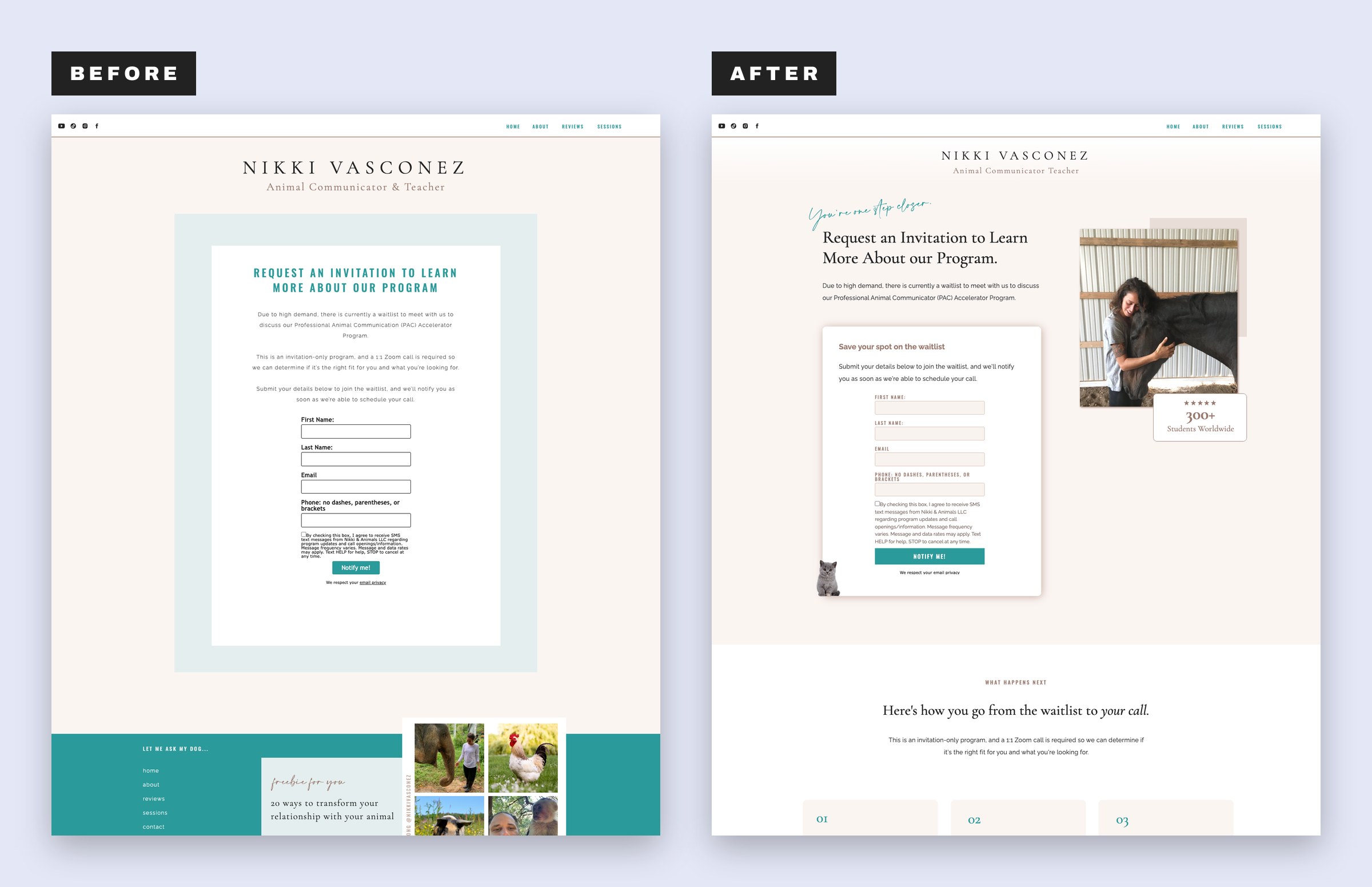
Before, the waitlist page was one pale box: a heading in teal capitals, a short explanation and a form. After, it keeps the invitation and adds what the box was missing… three steps show the whole path (join the waitlist, get a message from the team, then a 1:1 Zoom call), a note says it is a conversation with no pressure, and the press logos and a student quote sit below the form!
A form on its own asks someone to hand over a name and a phone number and hope for the best. Showing the three steps next to it tells people what happens after they hit “Notify me!”
The call page
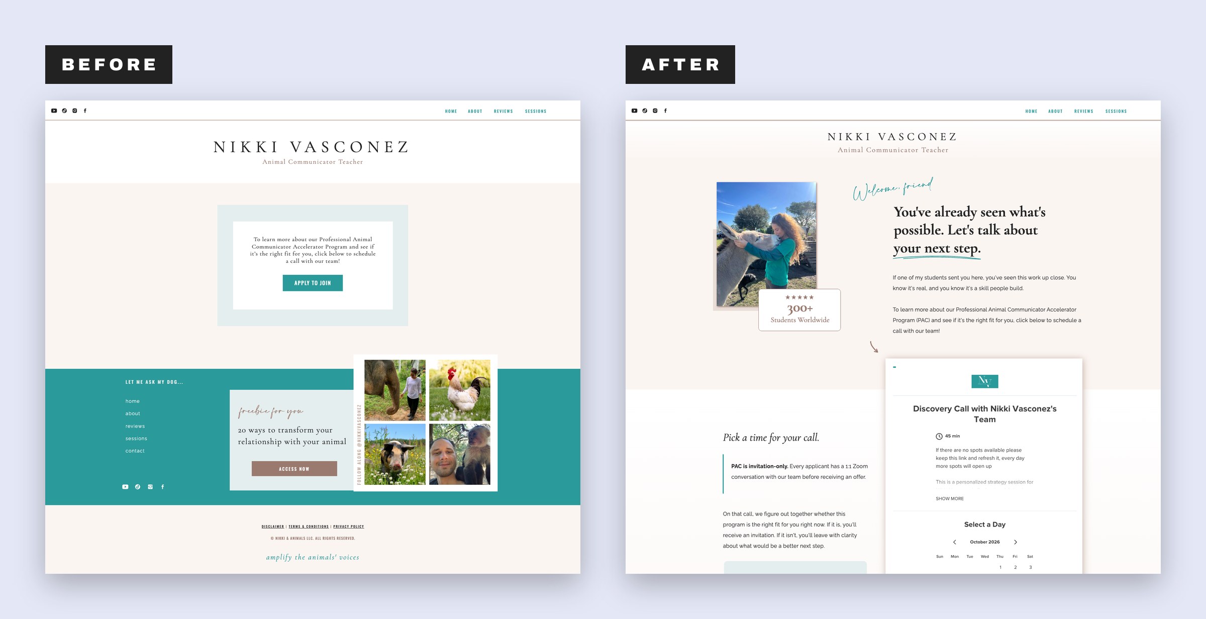
The old call page was one box with one sentence and one button. The new one has a calendar on the page!
It sits under a headline that picks up where the homepage left off, with the invitation-only rule spelled out beside it. If none of the times work, the page says to save it and check back, because new dates open up. Below the calendar, the four-part path inside the program is laid out (learn the skill, build depth and precision, run a real business and, if you want to, teach others), along with snippets from students who came from bookkeeping, hospice nursing and 22 years in real estate.
What happened to the sales calls
From a30 to 40 minute average, dropped to as short as 12 minutes to close!
What produced it? a sales page redesign, copy plus design, not a full website build. Shorter calls with pre-sold leads is what a sales page is supposed to do. The page handles the explaining, so the call can be about fit!
Every page I redesign or audit goes through the RAINBOW Method, my conversion framework, exactly how I (Ingrid Urena) work this developing magic.
For the course creator whose program starts with a call
If your program starts with a call, your pages have a different job than a page with a checkout button. They are not there to close the sale alone. They are there to make the call about fit instead of an explanation of the basics.
So here is where I would look first: does the sales page say what the program is and who it is for in the first screen? Does every button say the same thing? Can someone see what happens after they apply, step by step? If any of those is a “not really”… start there! (And no, you do not need a full website rebuild to fix it. Nikki’s was a redesign of a handful of pages.)
Want your pages to do the selling before the call?
That is the work inside Sell-Ready: a conversion tune-up for a page you already have, or a sales page built around the offer you are selling. See how the Sell-Ready conversion tune-ups and sales pages work →
filed under:

I'm Ingrid, welcome! I'm a branding designer + Showit Design Partner, doggy mamma, and tea drinker.
get to know me »



P.S. Found value in this post? You can always drop a little something in the treat jar — this goes toward treats for my pup (yes, Yui loves it) and fueling more great content! 💜
Ready to turn your website into a powerhouse lead generator even on a saturated market?
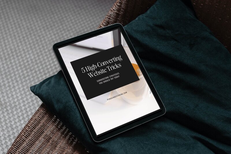
My free guide, "5 High Converting Website Tricks", gives you key strategies to create a website that showcases your brand, attracts your ideal clients, and is ready to convert them into paying customers.
Download now for free!
Featured Case Studies
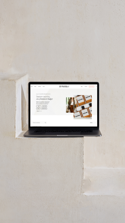
Jen Wagner Co
Shopify to showit with Woocommerce shop Migration
TIQUE
Custom Brand + Showit Website + Shop

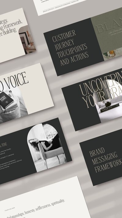
Blanc Salváge
Brand Strategy + showit Shop Design + Copywriting
Revitalized Health & Wellness Counseling
Custom Brand + Website

Wordfetti + Wordshop
showit Website + shop Design & Development

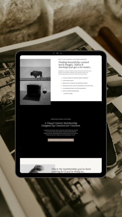
Editorial Stock Images
showit shop + Multi-level Membership


Amy Posner
Brand Strategy + Custom Brand + Showit Website

Our clients lead their industry.

Hi I’m Ingrid
I design strategy-led brands and Showit websites that confidently represent you.
I’m a designer with a magic touch for monetizing websites. I’m also a tea-lover, dog momma, Ravenclaw, INFP and 2w3 (for all you personality-test nerds like me).
I’ve also been called a Showit website expert (been with them since 2013), and a sucker for understanding customer journeys, brand psychology, and consumer and sales psychology. My clients have some pretty cool results after working together, things like doubled shop conversions, booked-out services in weeks, and increased monthly revenue, among other cheer-worthy celebrations.