Your footer can make you money

This post is part of the RAINBOW Method, developed by Ingrid Urena. It goes deeper on Window of opportunity, the seventh of the seven stages.
You ever stare at your footer like it’s the DMV waiting room of your website? Just… something you have to have, filled with whatever didn’t make the cut anywhere else?
I get why. Most people are scared their footer is going to look crowded, or they genuinely don’t know what to put down there.
And there’s a real fear behind that: cram ten links into your main menu and you will lose customers, because you’re sending them somewhere other than where you actually want them to go. Nobody wants to make that mistake twice, so the safest-feeling move is to just… not think about the footer at all.
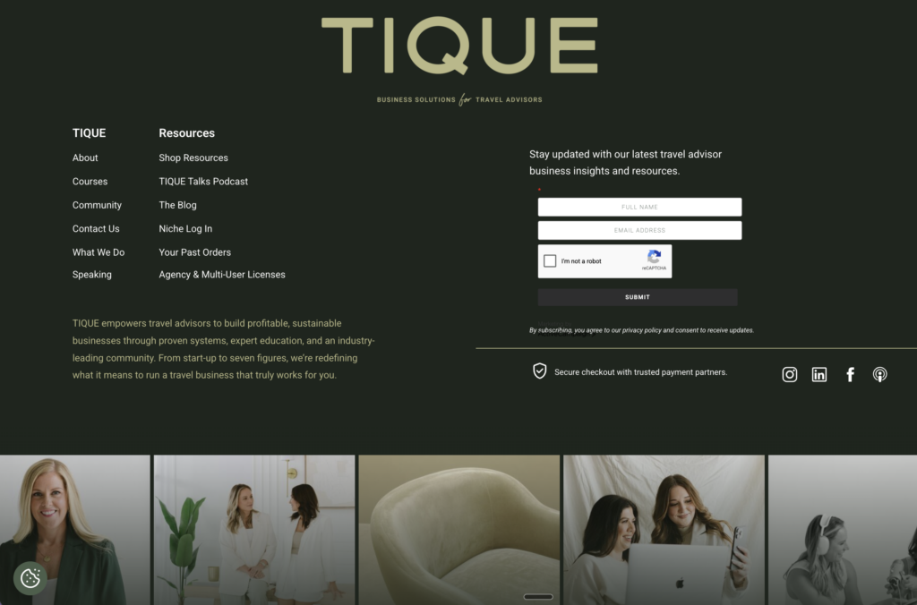
But the footer isn’t your main menu, AND it was never supposed to carry the same job. Think of it as your safety net. Your last drawer. The spot where someone who’s scrolled all the way down, and still hasn’t found the thing they needed, gets one more shot at finding it: your freebies, your services, the one page you really want them to land on.
You don’t want to crowd the top of your site with all of that. This, right here, is the perfect place for it!
Your heatmap is telling you something you’re ignoring
If you’ve ever actually looked at your own heatmap, you already know this: people use the footer. A lot. Not because it’s flashy, but because of what’s happening everywhere else on the page.
Most menus these days are either a hamburger icon hiding everything behind three little lines, or a deliberately short main nav because we, as the site owners, are steering people toward a handful of choices instead of overwhelming them. Both of those are good strategy… but they also mean a chunk of your visitors are left wanting to explore more than what’s in front of them. Nielsen Norman Group actually measured this: in a study of 179 users across 6 different sites, hiding your main navigation behind something like a hamburger menu cuts discoverability almost in half. (People don’t stop wanting to look around, they just stop finding what’s hidden!)
So where do they go instead? Down. To you-know-where.
The same research team has documented this from the other direction too: people use footers as either a second chance to be convinced after reading everything above and still not committing, or a last resort for hard-to-find content when what they need isn’t in the main nav at all. Same behavior, two very different reasons.
This is also why your footer is such a strong SEO signal, by the way! Your quick SEO blurb, the one repeated across every single page because it lives in the footer, is one of the most consistent, sitewide signals you can send. It’s small, it’s easy to overlook, and it works quietly in the background every time someone lands on any page of your site, not just the homepage.
If you want to understand more of what SEO is doing behind the scenes for you, Before You Blame Showit SEO, Read This is worth a read after this one.
The one place I actually want your social links
Here’s a rule I don’t budge on: the footer is the only place I will ever let you put a link that sends someone off your website. Social media, YouTube, wherever.
I never want to see a social media icon in your main menu or your top bar. Never!! That’s you, standing at your own front door, handing your visitor a map to somewhere else before they’ve even had a chance to look around your home. Every one of those top-of-page social links is an invitation to leave, and every visitor who leaves is a conversion that just… stopped happening.
Your page structure only works if people stay on the page long enough to actually convert, and a top-bar Instagram icon is basically a designed exit ramp. We are not doing that.
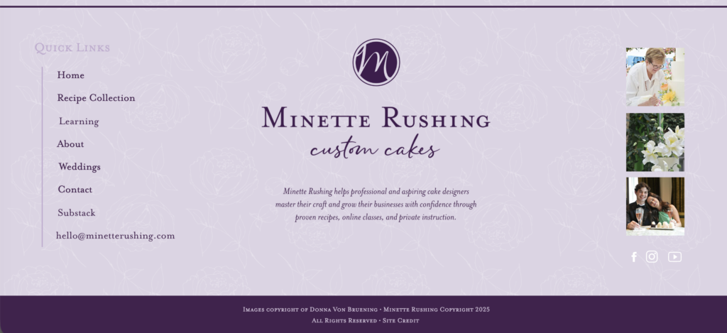
Down in the footer, though? Go for it. Link your LinkedIn, your YouTube, your Instagram. By the time someone’s scrolled this far, they’ve already spent real time in your world: reading your services, maybe even submitting an inquiry, and now they want to know more about you as a person or a brand. That’s the moment to hand them the map, not before it. I’m not telling you to skip social links altogether, but I’m telling you to link them in the right room of the house, at the right point in the visit.
Catching the almost-gone visitor
This is also your last real chance to keep someone in your universe before they close the tab.
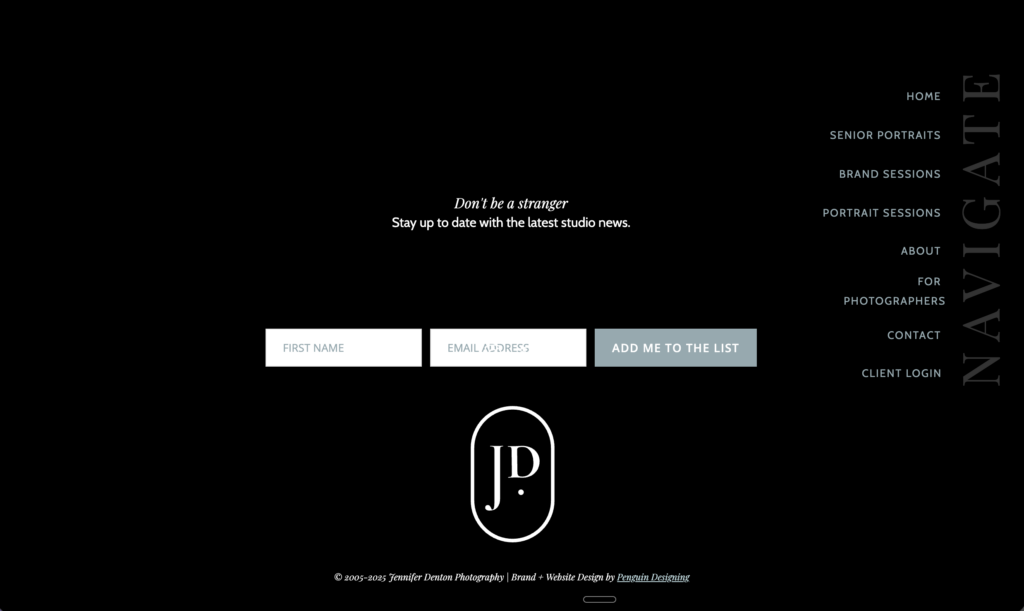
If you have a newsletter, your footer is the spot to catch that “almost gone” moment, the person who scrolled the whole way down and was about to leave anyway. A simple opt-in there means the visit doesn’t have to end when the page does; it just moves somewhere new, into your inbox instead of out of your world entirely. And if you’re active on Instagram, a live grid down there does the same thing in a different room: it gives someone one more way to stay connected to you, even if they’re not ready to buy or inquire today.
None of this needs to be loud flashy or oversized. It just needs to be there, waiting for the exact person who’s about to leave and would actually stay if you gave them a reason to.
Want a full self-check on where your website might be leaving these little moments on the table, footer included? Grab my free Website Optimization Checklist. It’s a self-assessment you can run against your own site today, no matter what platform you’re built on. 💜
Give your footer room to be you!
Here’s the thing I really want you to walk away with: your footer does not have to be a shy little strip at the bottom of the page. It can take up real space. It can be fun. It can sound like you.
Mine has an entire line in it about who’s welcome here, because that’s not a value I say once and move on from, it’s one I want repeated on every single page of my site. That’s what a good footer does! It’s not an afterthought bolted on because the page technically needed to end somewhere. It’s one more chance to say the thing you care about, one more nudge toward the page that matters, one more reason for someone to keep clicking around instead of closing the tab.
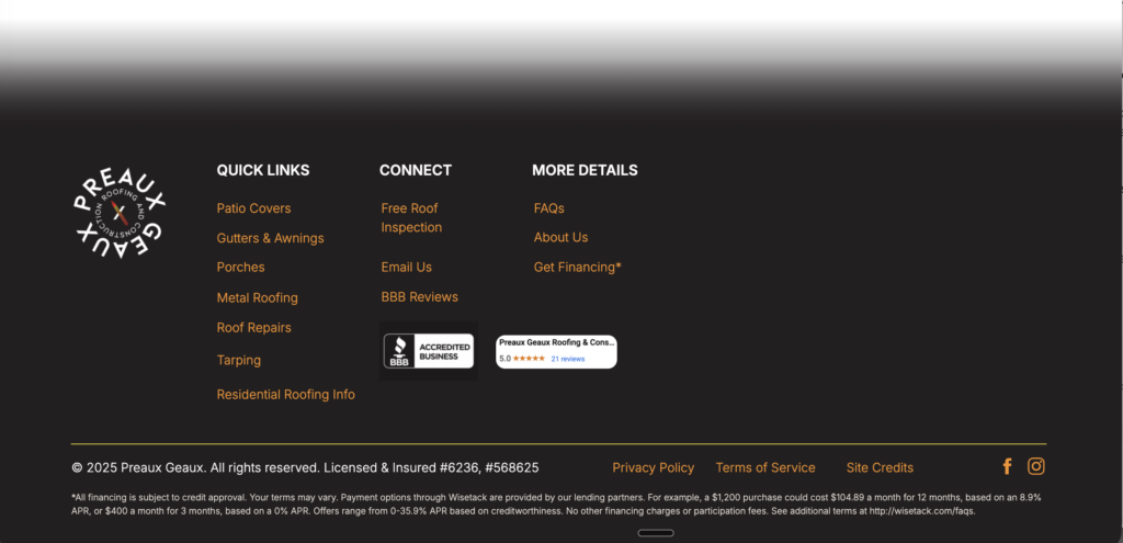
And you have room to be intentional about what goes down there beyond just links: your contact info for the person who’s decided they’re ready to reach out, a small nod to the results or names you’re proud of if that fits your brand, maybe even a short version of your main navigation if your pages run long and someone’s already scrolled past the top nav entirely.
Treated right, your footer becomes part of the PDP Experience Loop I build into every project: it’s a Post moment doing Pre-level work, funneling people who already made it to the bottom of your page right back into the During, whether that’s an inquiry, a purchase, a freebie download, or an enrollment. Don’t let it be the part of your website with no more energy left, the one section that got the leftover five minutes at the end of a build. Make it as intentional as everything above it (please!)
If you want eyes on your specific footer (and the rest of your page structure while we’re at it), that’s what my CRO Audit is for: my RAINBOW Method applied page by page, with specific, actionable recommendations instead of vague notes. Send me a message here!
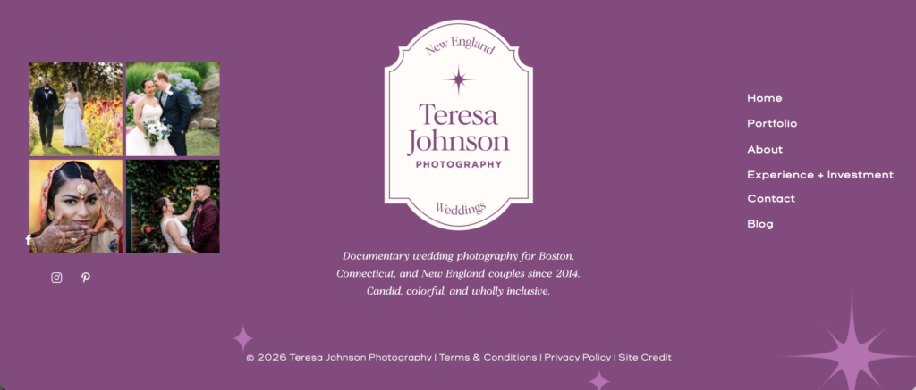
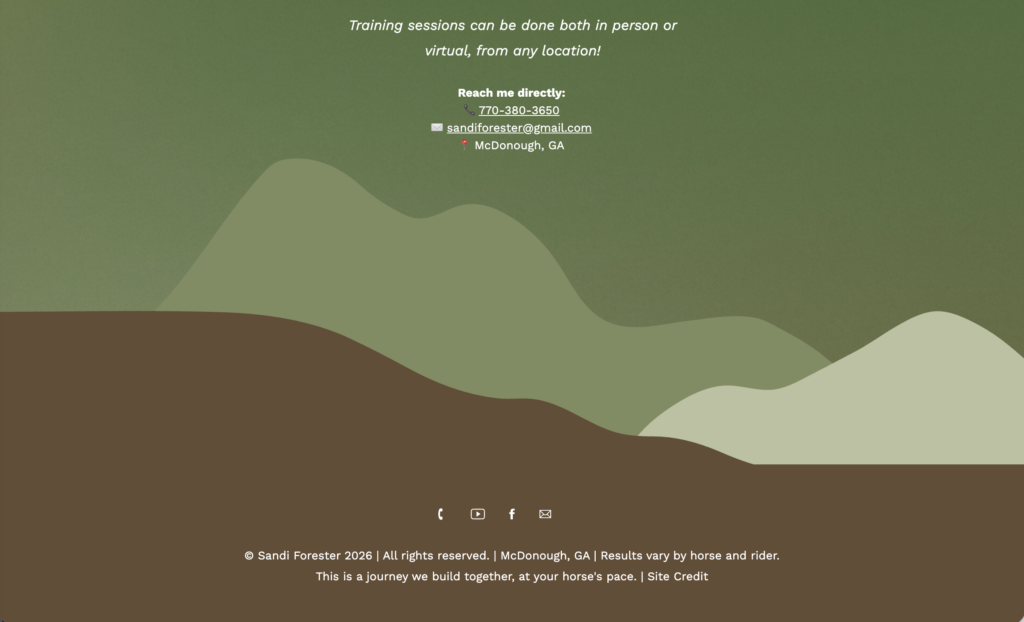
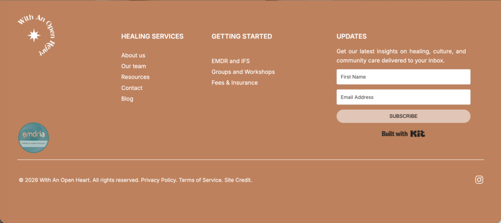
Some great footer examples
filed under:

I'm Ingrid, welcome! I'm a branding designer + Showit Design Partner, doggy mamma, and tea drinker.
get to know me »




P.S. Found value in this post? You can always drop a little something in the treat jar — this goes toward treats for my pup (yes, Yui loves it) and fueling more great content! 💜
Ready to turn your website into a powerhouse lead generator even on a saturated market?
My free guide, "5 High Converting Website Tricks", gives you key strategies to create a website that showcases your brand, attracts your ideal clients, and is ready to convert them into paying customers.
Download now for free!
Featured Case Studies
Jen Wagner Co
Shopify to showit with Woocommerce shop Migration
TIQUE
Custom Brand + Showit Website + Shop

Blanc Salváge
Brand Strategy + showit Shop Design + Copywriting
Revitalized Health & Wellness Counseling
Custom Brand + Website

Wordfetti + Wordshop
showit Website + shop Design & Development

Editorial Stock Images
showit shop + Multi-level Membership


Amy Posner
Brand Strategy + Custom Brand + Showit Website

Our clients lead their industry.

Hi I’m Ingrid
I design strategy-led brands and Showit websites that confidently represent you.
I’m a designer with a magic touch for monetizing websites. I’m also a tea-lover, dog momma, Ravenclaw, INFP and 2w3 (for all you personality-test nerds like me).
I’ve also been called a Showit website expert (been with them since 2013), and a sucker for understanding customer journeys, brand psychology, and consumer and sales psychology. My clients have some pretty cool results after working together, things like doubled shop conversions, booked-out services in weeks, and increased monthly revenue, among other cheer-worthy celebrations.